Email Redesign
THE CHALLENGE
Working in a company the size of ASOS there are technical and physical changes happening daily, which will affect many employees in their day-to-day tasks. To correctly manage this and prevent any significant issues arising ASOS has a team that manages these changes and notifies everyone who could be affected by them.
The Change & Release Team contacted my Team as they were having issues with the current emails they were sending around; this was because they were mostly being deleted or ignored. It was my role to understand what the problems were and to improve the open rate of the emails.
THE PROCESS
Research
To understand the next steps, I first had to understand the problem. Being new to these emails and not knowing the importance of the information within them, I organised to speak to the two user groups that used them. These were the Change & Release Managers, who sent out the emails, and the Tech team who received them.
Speaking with the Change & Release Managers, I gathered what information was most important to them, what requirements they had regarding the information that had to be in the emails, and what information was more flexible.
The second user group was the Tech team. These were the people who received the emails and required the information that was in them to do their job. Before contacting the Enterprise UX/UI Team, the Change & Release Team had already sent out a survey which I was able to analyse and gave me a good understanding of how the current emails were serving their users needs. However, I also wanted to gather qualitative data and to do that I conducted interviews with members of the Tech Team. These included engineers from the iOS, Android, Web and Back Office Systems.
Findings
From the research and analysis of the current template, I observed several pain points that I needed to tackle. They were:
Unresponsive email designs - Were only for desktop size screens.
The hierarchy of information was incorrect.
They weren’t accessible as the information was in an image.
They wanted to see immediately if the issue would affect them - The current system didn't display this well, so most users were sending them all to another folder or trash.
In general, they wanted something more visually appealing and modernised.
I created various screens and tested these with users, as well as showing them to the Brand Team. The feedback I received helped inform the next iteration.
After creating the next iteration of the designs, I brought them to the Team for a peer review and implemented the tweaks.
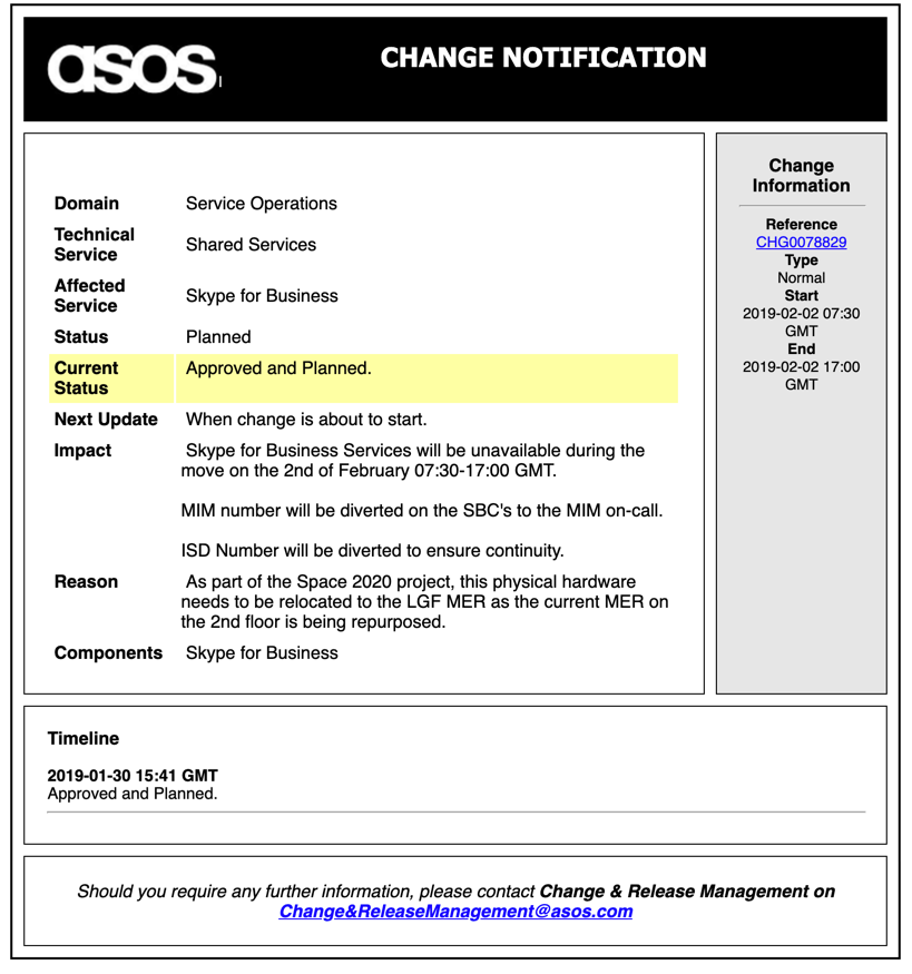
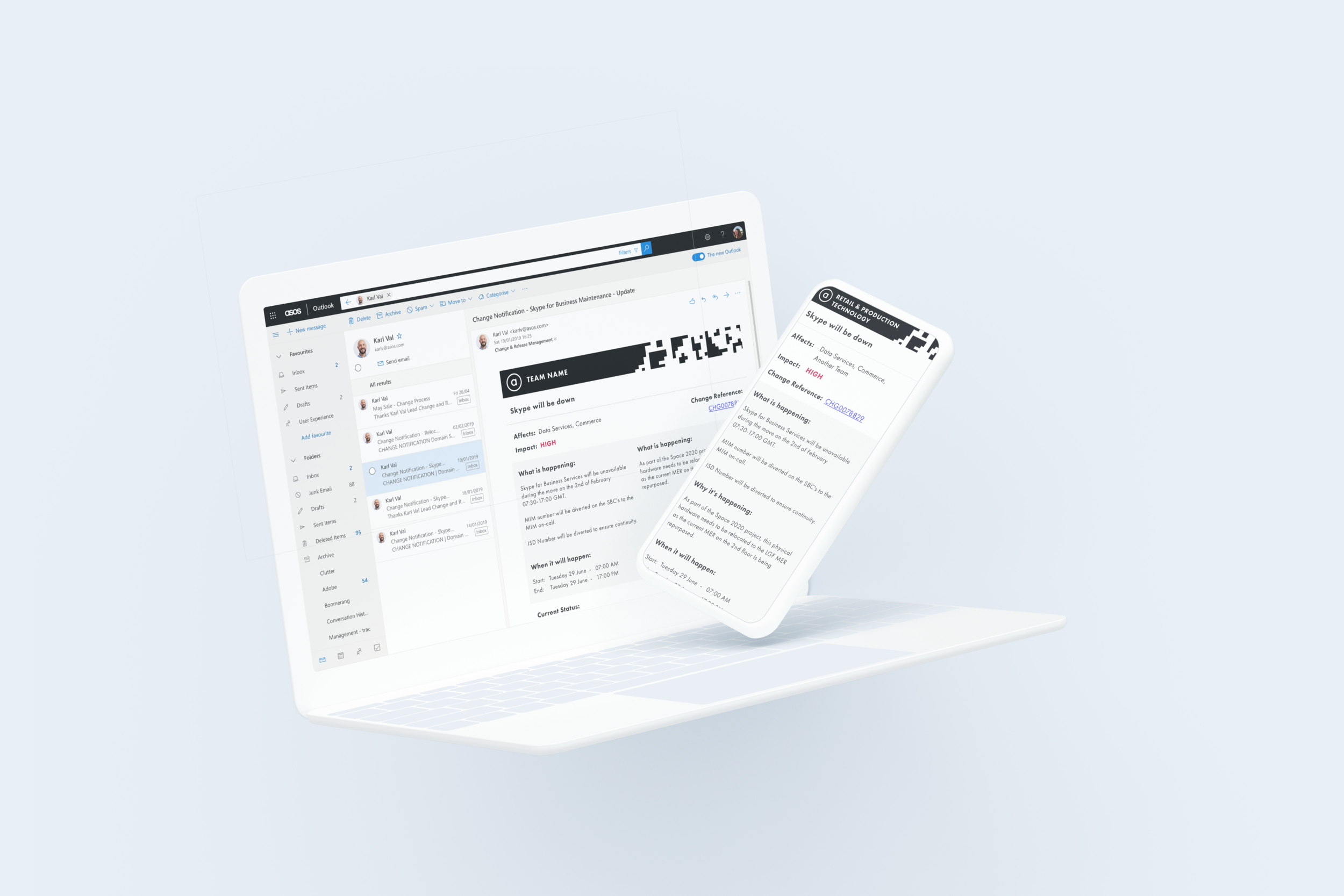
The current C&R notification email - Unresponsive design using an image as a template.
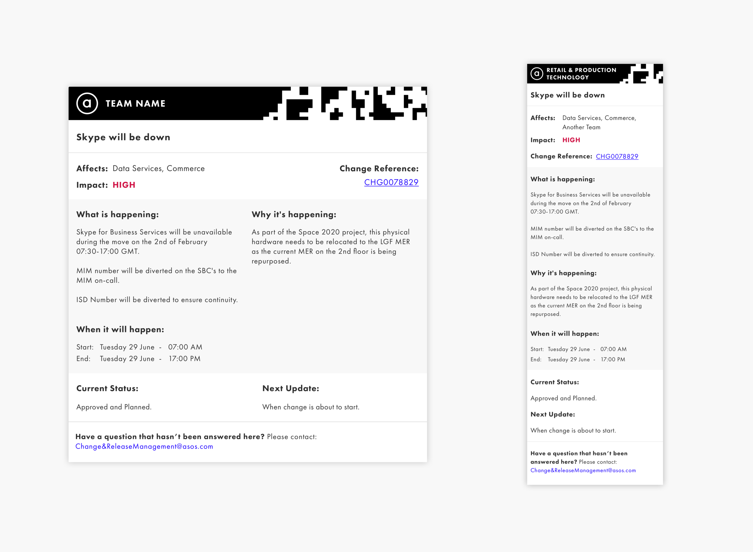
THE SOLUTION
In the image on the left, you can see how I combatted the pain points I mentioned above. The way I did this was:
Start mobile-first - as the design needed to be responsive, I designed on the smallest viewport first to ensure the emails would scale correctly.
Rearranged the information architecture - brought up the information that was most important to the user.
Used the team name in the header of the email and highlighted which teams the change affected, so that users could immediately decide whether the information below was relevant to read.
Used natural language - By using titles like, 'What is happening', 'Why it's happening' and 'When it will happen' I made the emails feel more conversational and humanised.
Aligning the UI with the ASOS branding both to modernise the design and keep it in sync with the rest of the Back Office tools.
Working with an external engineer, we went through a process of analysing the designs and mapping any new fields that we would need to create to fulfil them.
This project was ongoing when I left.