OLIO
OLIO Header Image
THE CHALLENGE
OLIO is a free mobile app with the mission to reduce waste by creating a community where people share surplus food and other unwanted items.
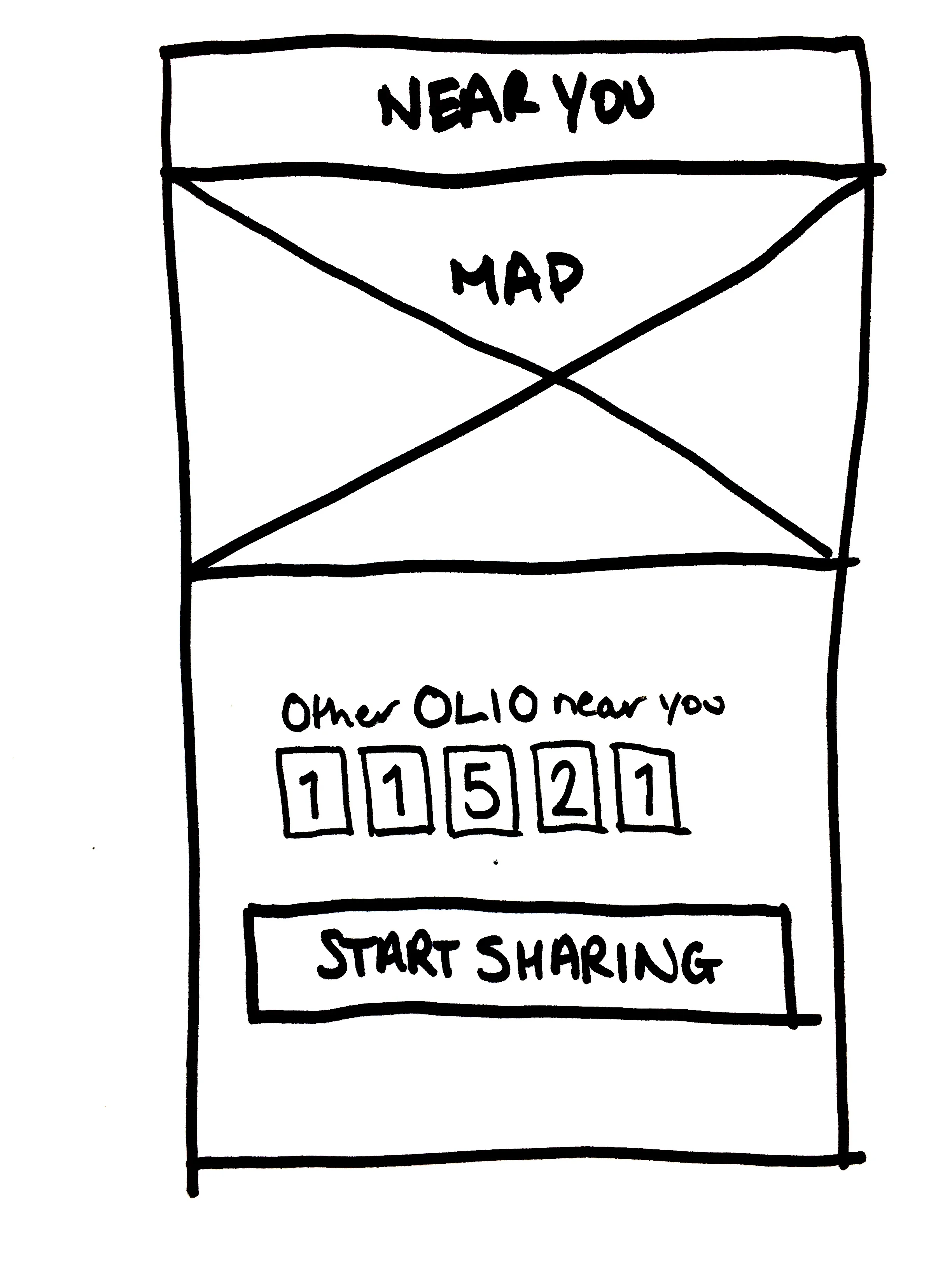
We were tasked with creating a positive onboarding experience that encourages users to add and request items, and to increase the sense of community by showing other users near you and their activity.
The Research
Competitor Analysis
Although OLIO has no direct competition in regards to its food sharing platform, now that it has moved into the general sharing industry that has changed.
In completing a competitive analysis we gained some valuable insight into best practices. The competitors we analysed all had one or more of the following:
Streamlined onboarding process
Use of graphics
Search functionality
Ability to access as a guest
User Insights
Before we started any design work we needed to ensure we were solving the right problem. We compiled a screener survey in order to find non-OLIO users to interview, as well as getting in touch with a number of current/past OLIO users.
From the non-OLIO users we discovered:
That the onboarding process was not where they struggled. The real confusion started once they had signed up and were interacting with the app itself.
The naming of the section ‘Just Shared’ was a real pain point. During testing, every user selected this when they wanted to find new items to pick up. The actual meaning of that tab was that these items had just been shared with (given away to) another user and were therefore unavailable.
“Where can I find things that have just been added?”
This was driving new users away from the app as they believed that there weren’t any items available. We advised OLIO to change the naming of this page to minimise confusion. They renamed it ‘Just Gone’ as they still wanted to demonstrate how many items were being shared overall.
From the current and past OLIO users we discovered:
The positives…
Loved feeling part of the community
Meeting new people
Reducing waste
The areas that needed work…
Challenging to add bulk items
Confusion with the donation function
Inability to save preferences
From our research we discovered that the biggest pain point for users was actually adding a listing. As this is one of the most important parts of app we believed the brief had to change.
Ideation
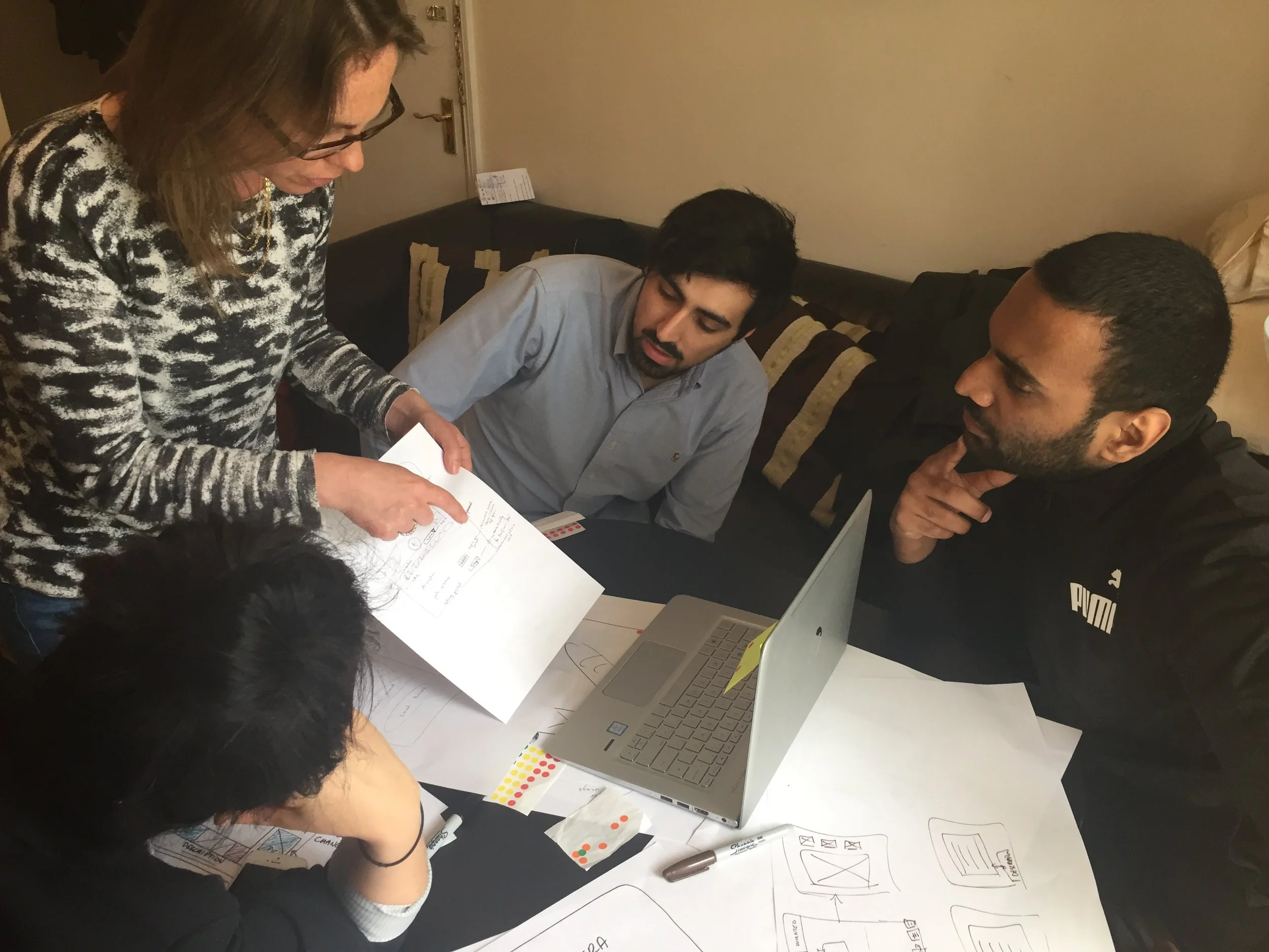
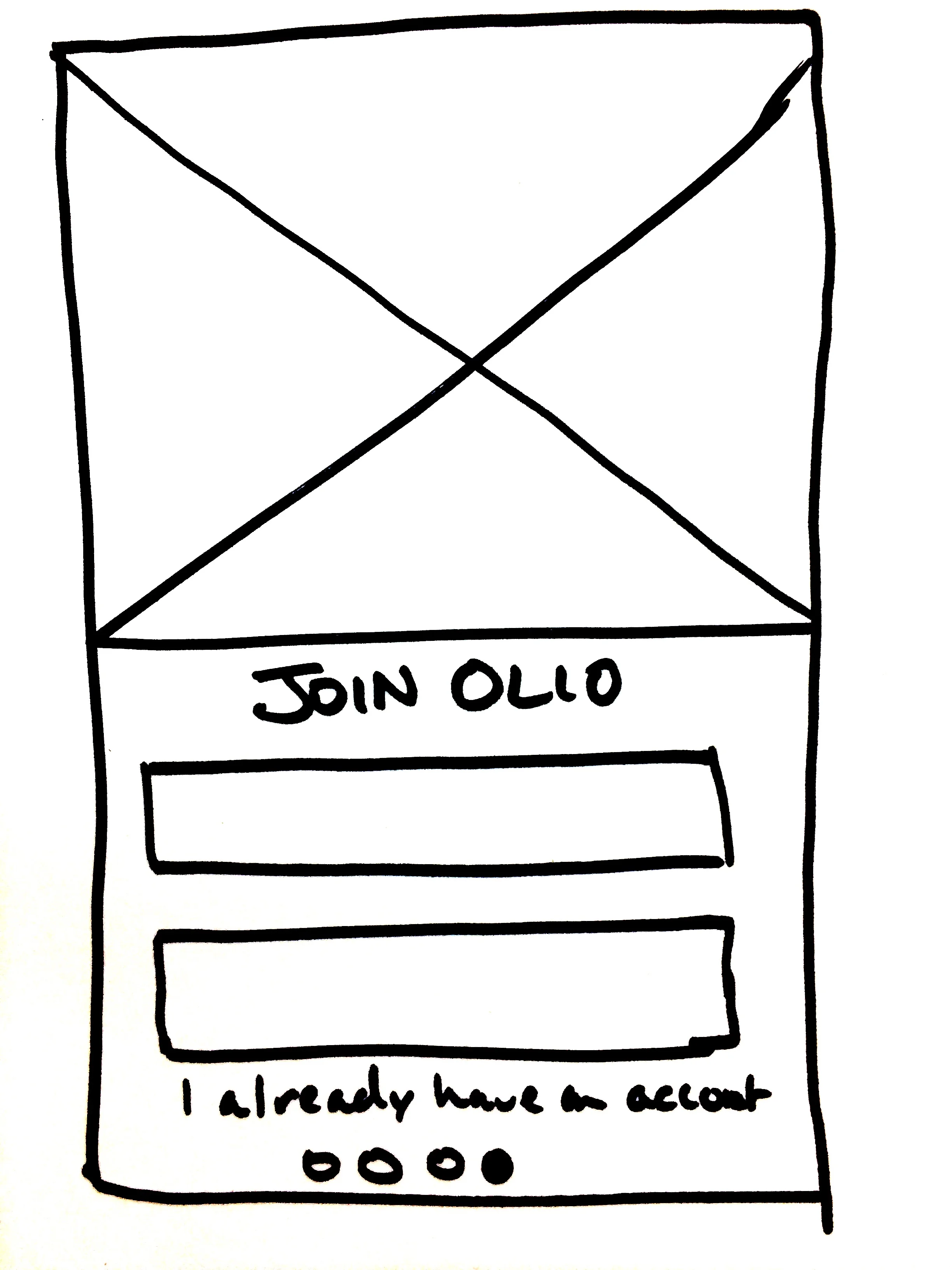
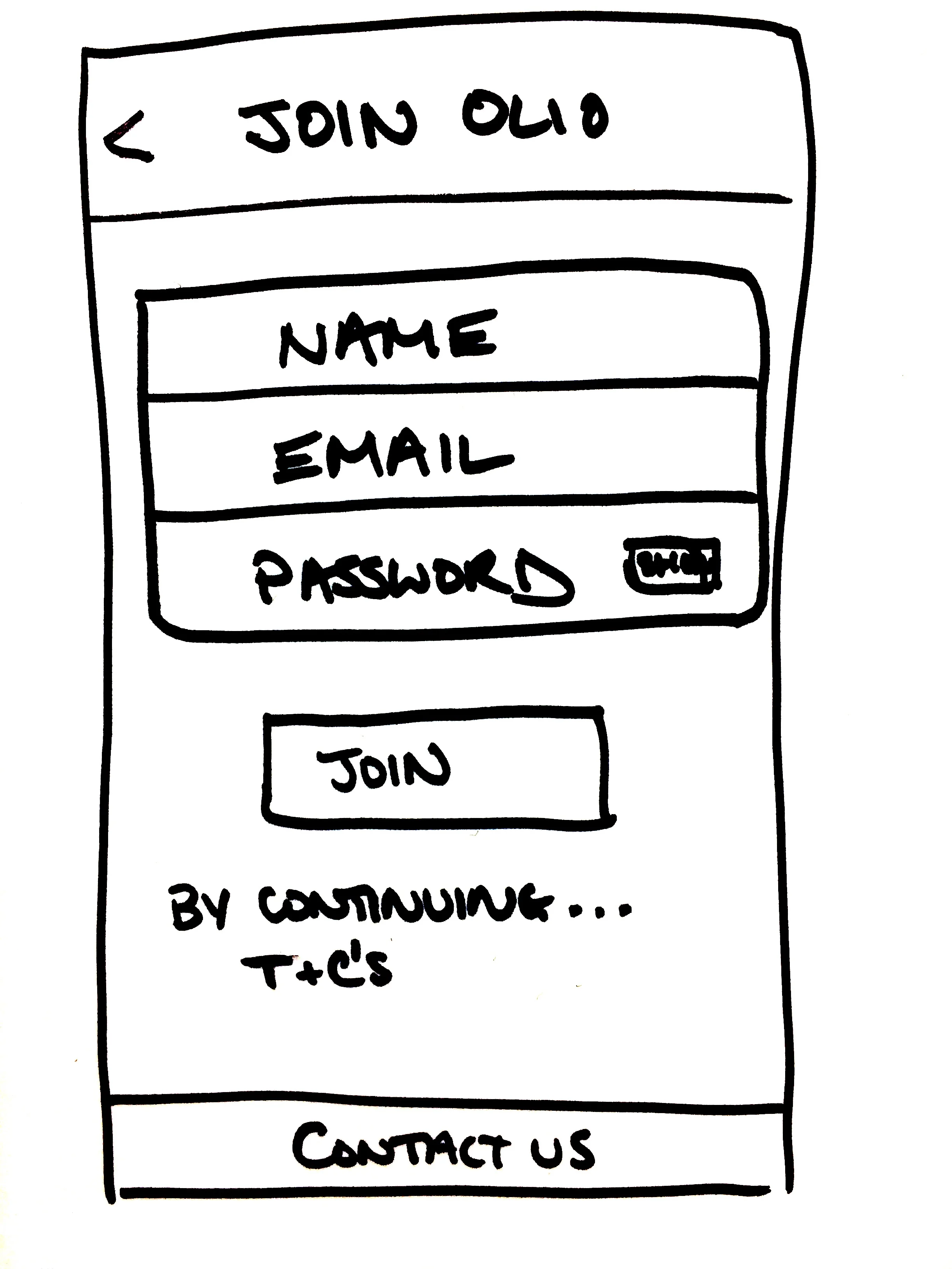
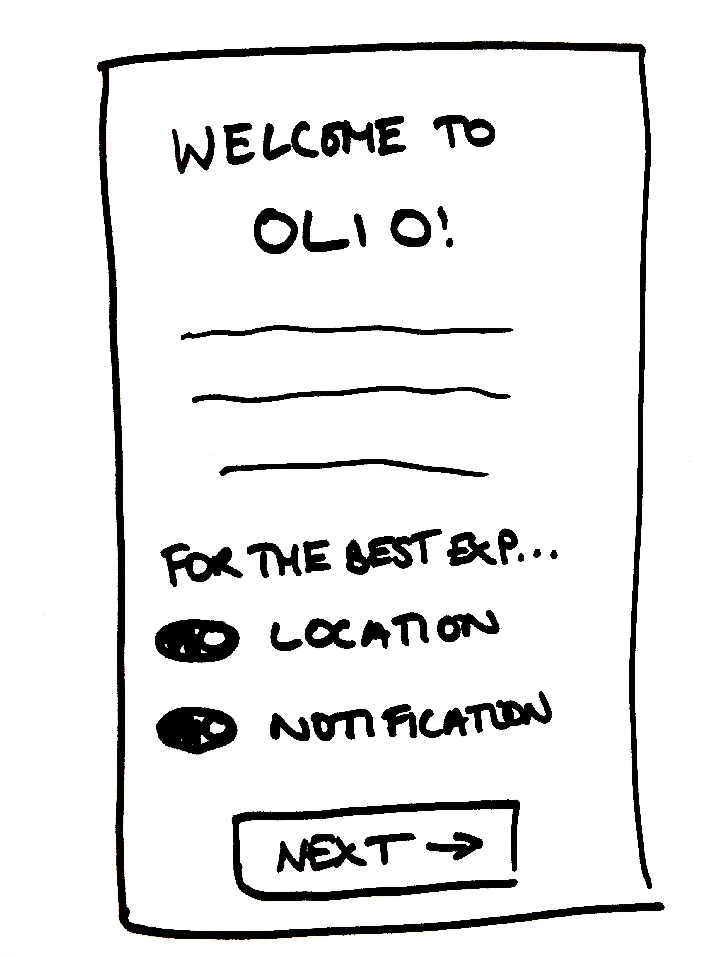
With our research completed we presented our findings back to members of the OLIO team. After agreeing to the new brief, which was to update the ‘Add Listing’ page and streamline the onboarding process, we held a design studio focused on this main listing screen.
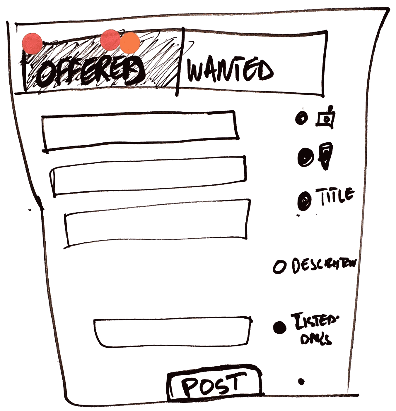
During the Design Studio session we worked together alone, presenting our work back to the group and dot voting after each sketching round. From this exercise the most popular features were:
Big images and the ability to edit them
Saving past items and addresses
One page to ‘Add Listing’ instead of having to scroll
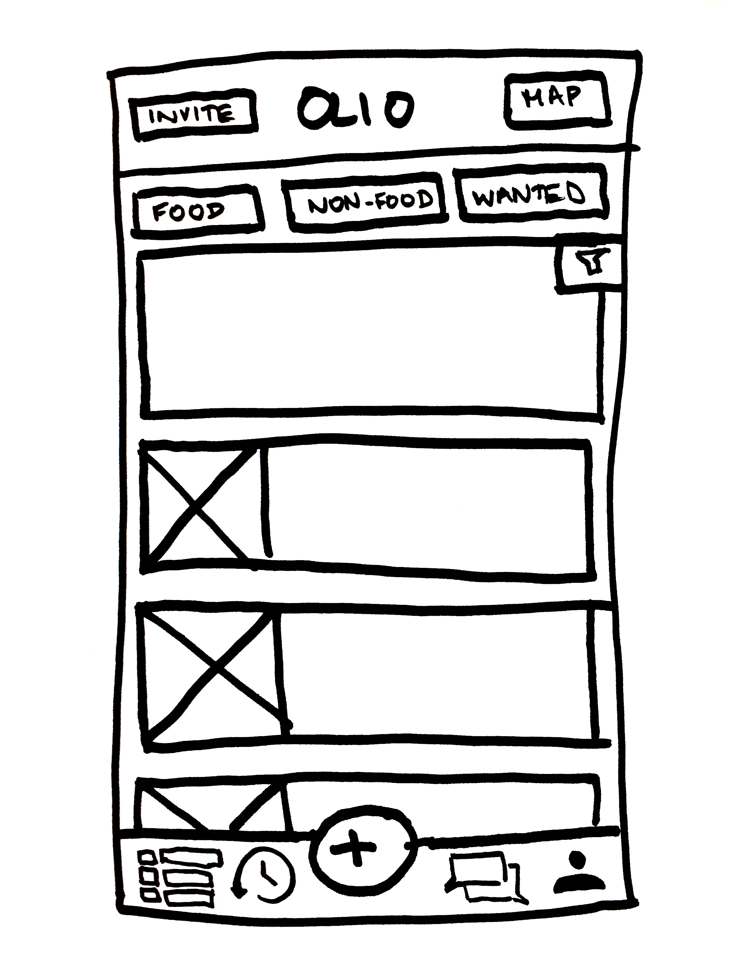
Tabbed page — so users could switch between food and non-food items.
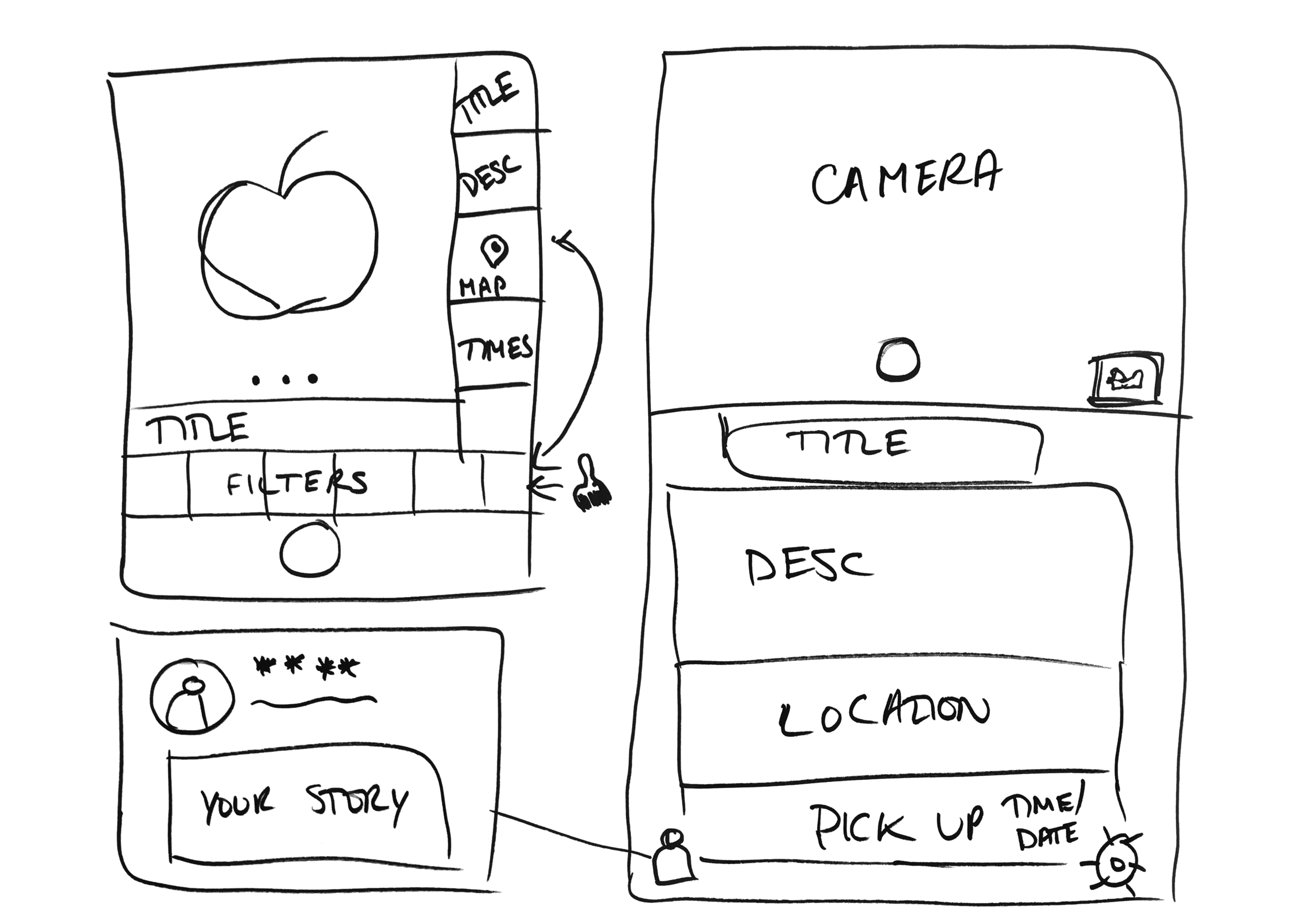
It was these features I focused on when creating our first sketches (shown in the gallery below).
Iterations
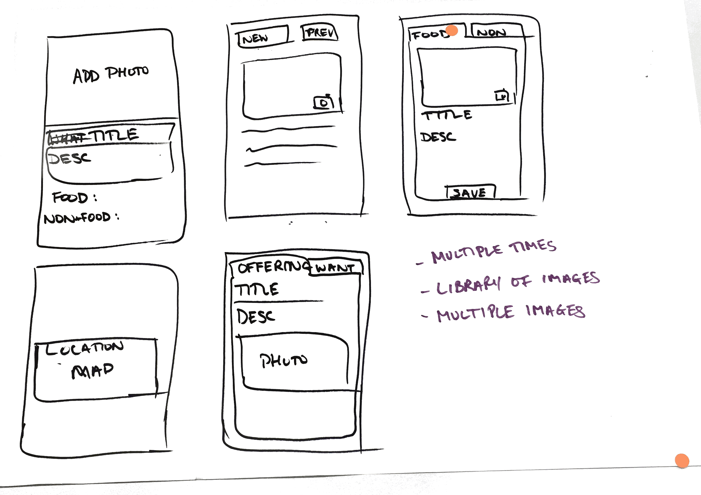
Based on findings from our user testing sessions, we iterated on each fidelity level of our prototypes. We found there were 5 key areas of focus:
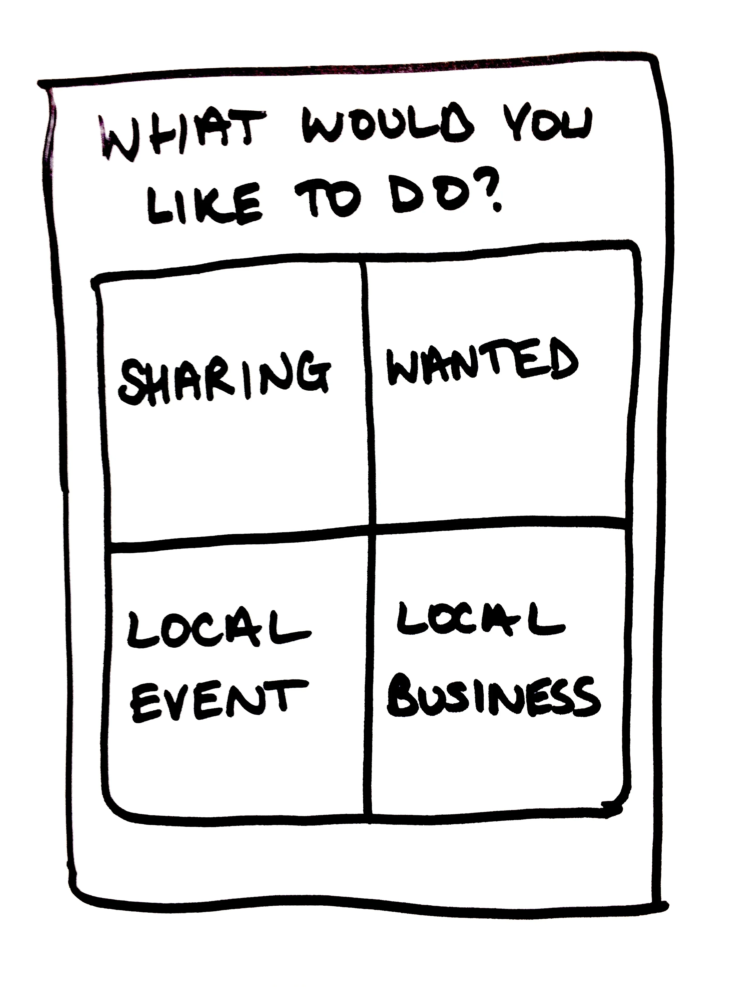
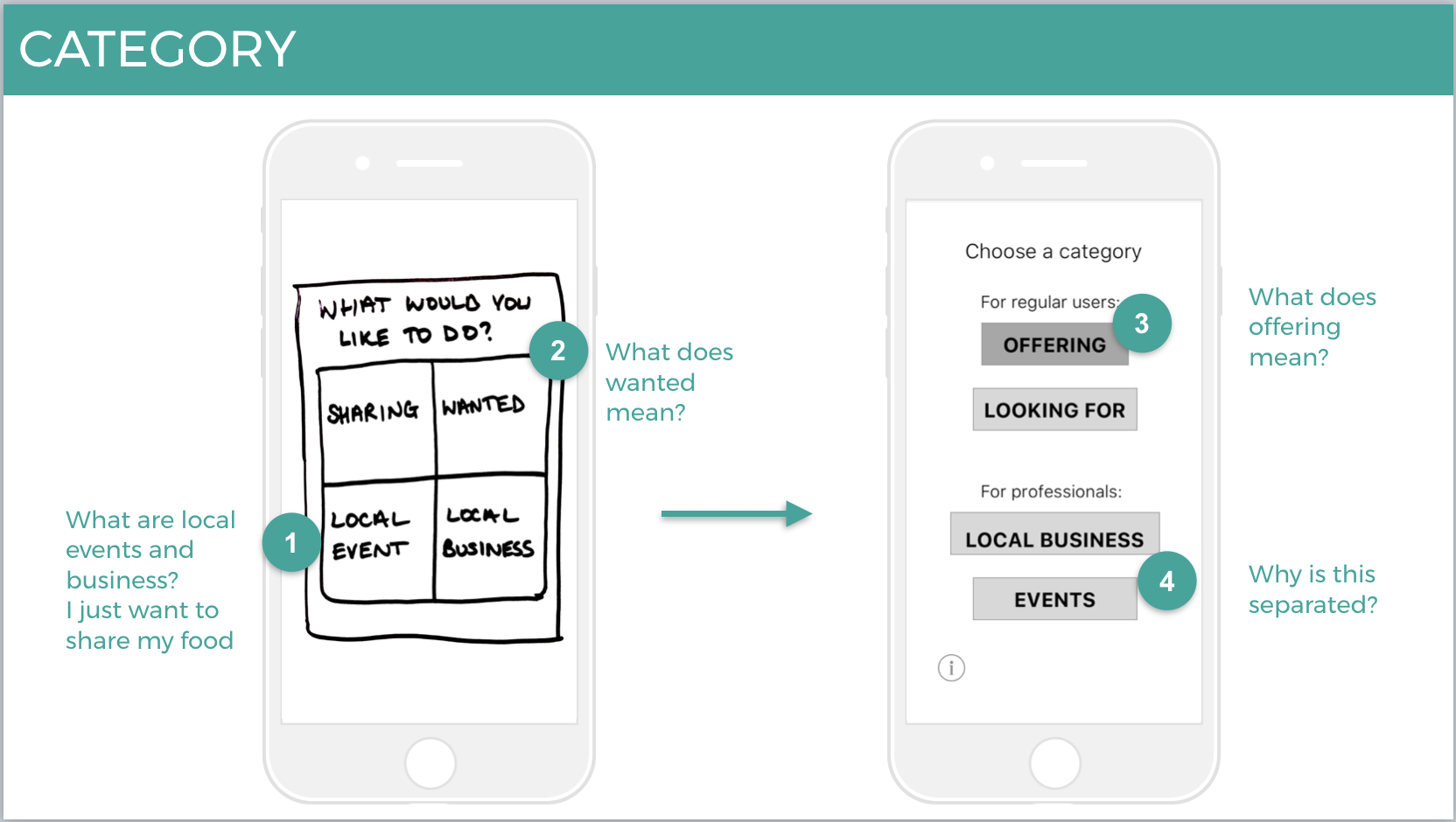
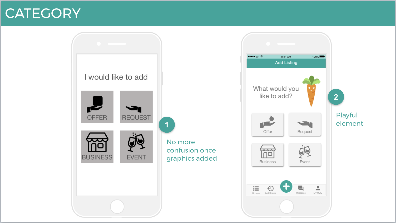
Category
As OLIO has recently decided to add new categories to their app we needed to design a way for users to select these before going to the ‘Add Listing’ page.
Through testing various layouts we found that squares with graphics was the easiest way for users to understand what they needed to select.
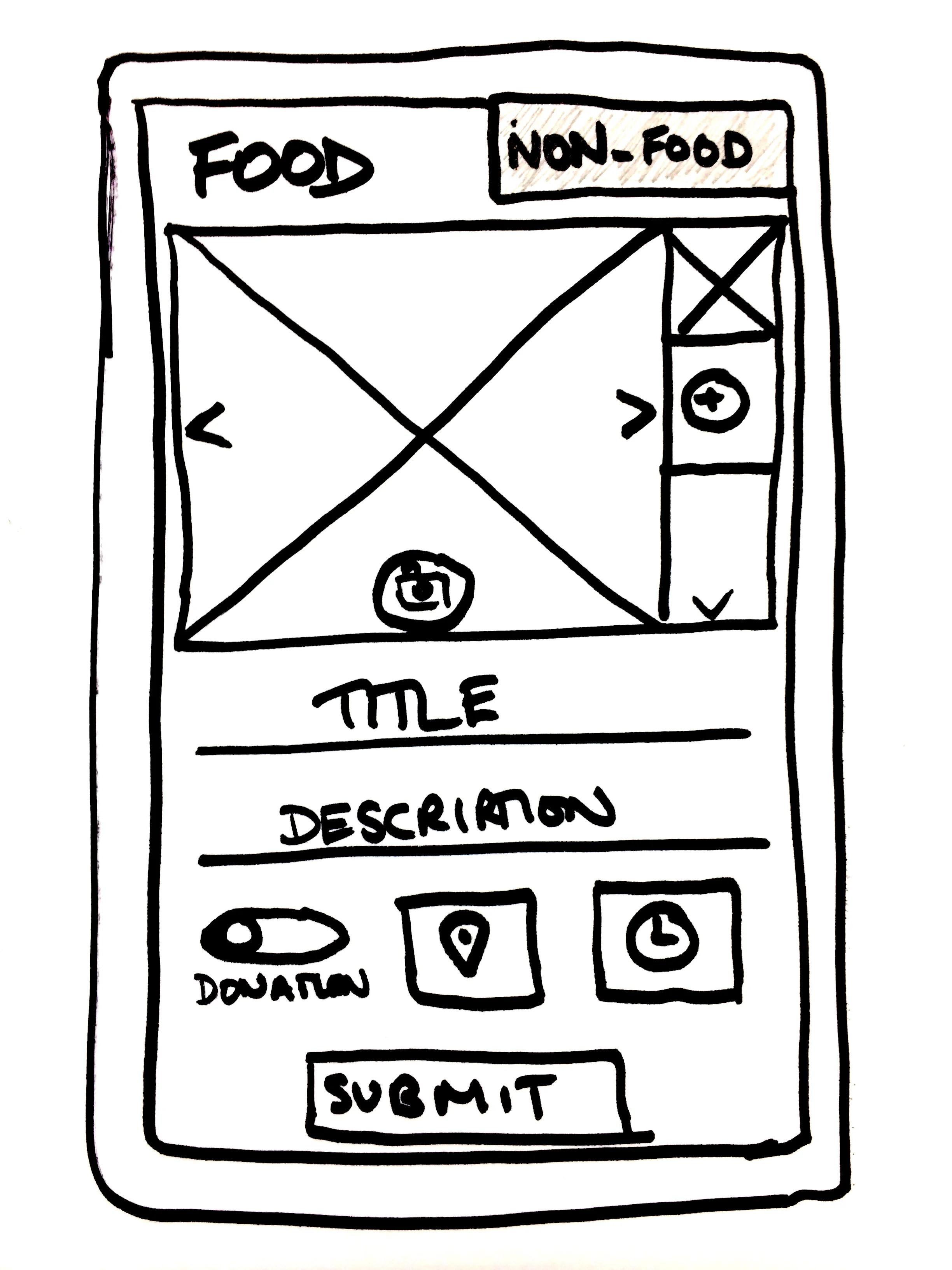
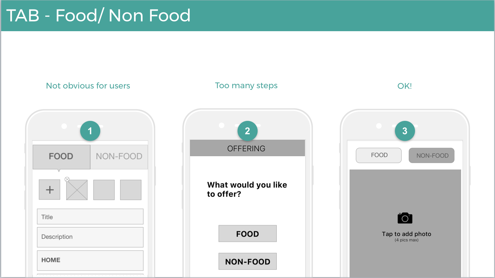
Tabbing
As we had discussed in the design studio session we tried to add a tab to the top of the ‘Add Listing’ page. This ended up being harder to understand so we settled on button selectors which our users found more appealing.
Preferences
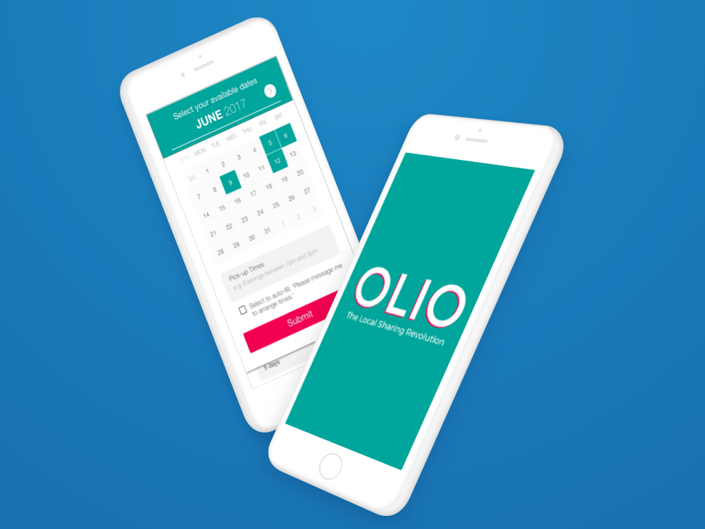
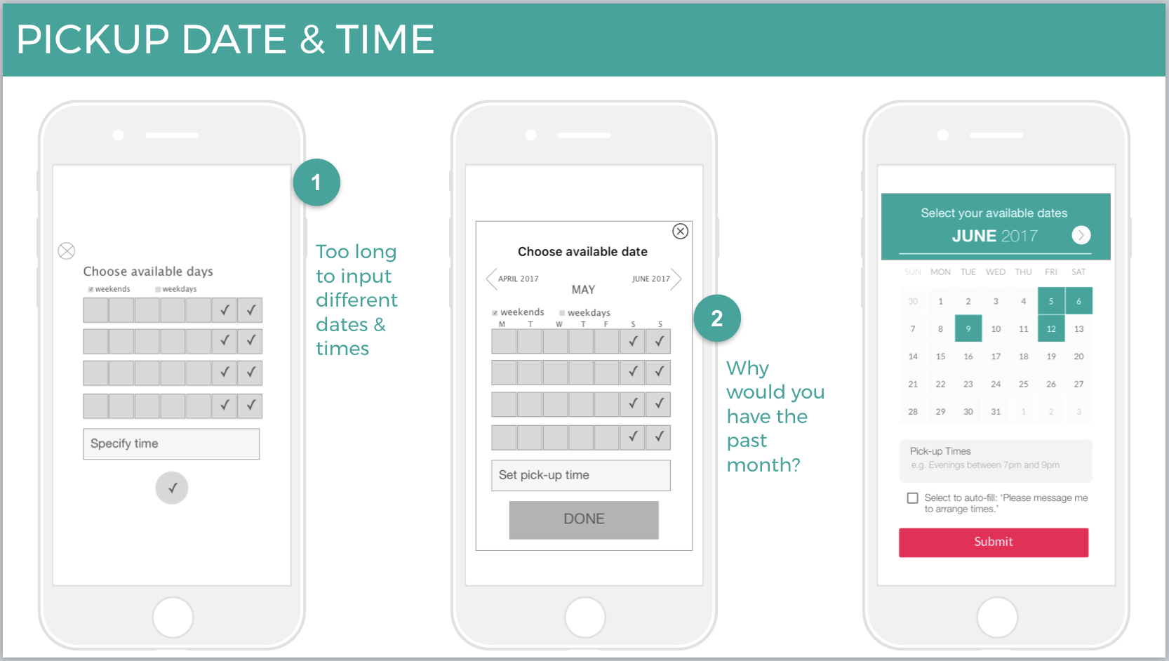
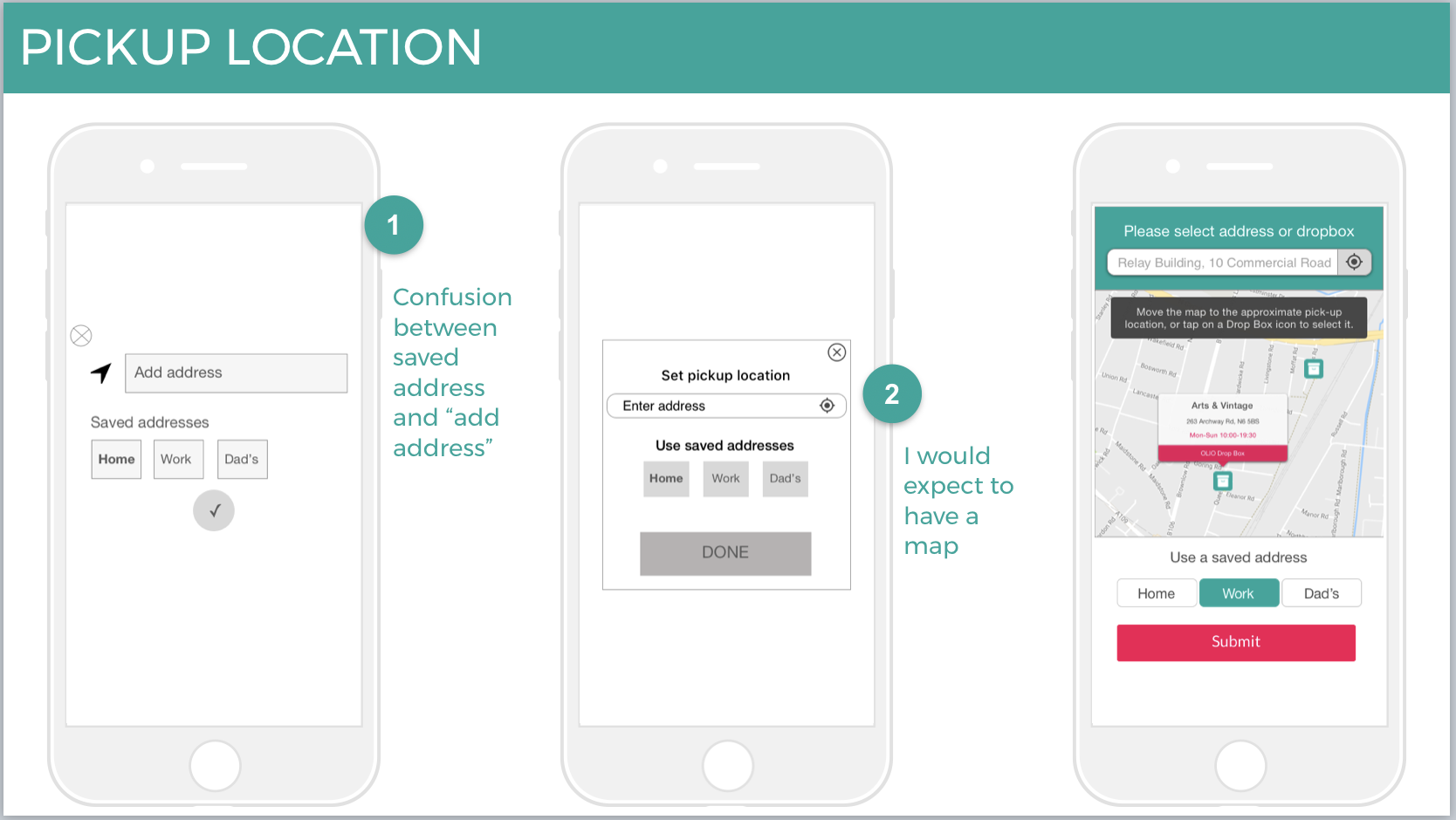
The ability to save preferences was important to the users we interviewed so we created a calendar and address pop-up so that they could easily select options they had used before and easily choose available dates.
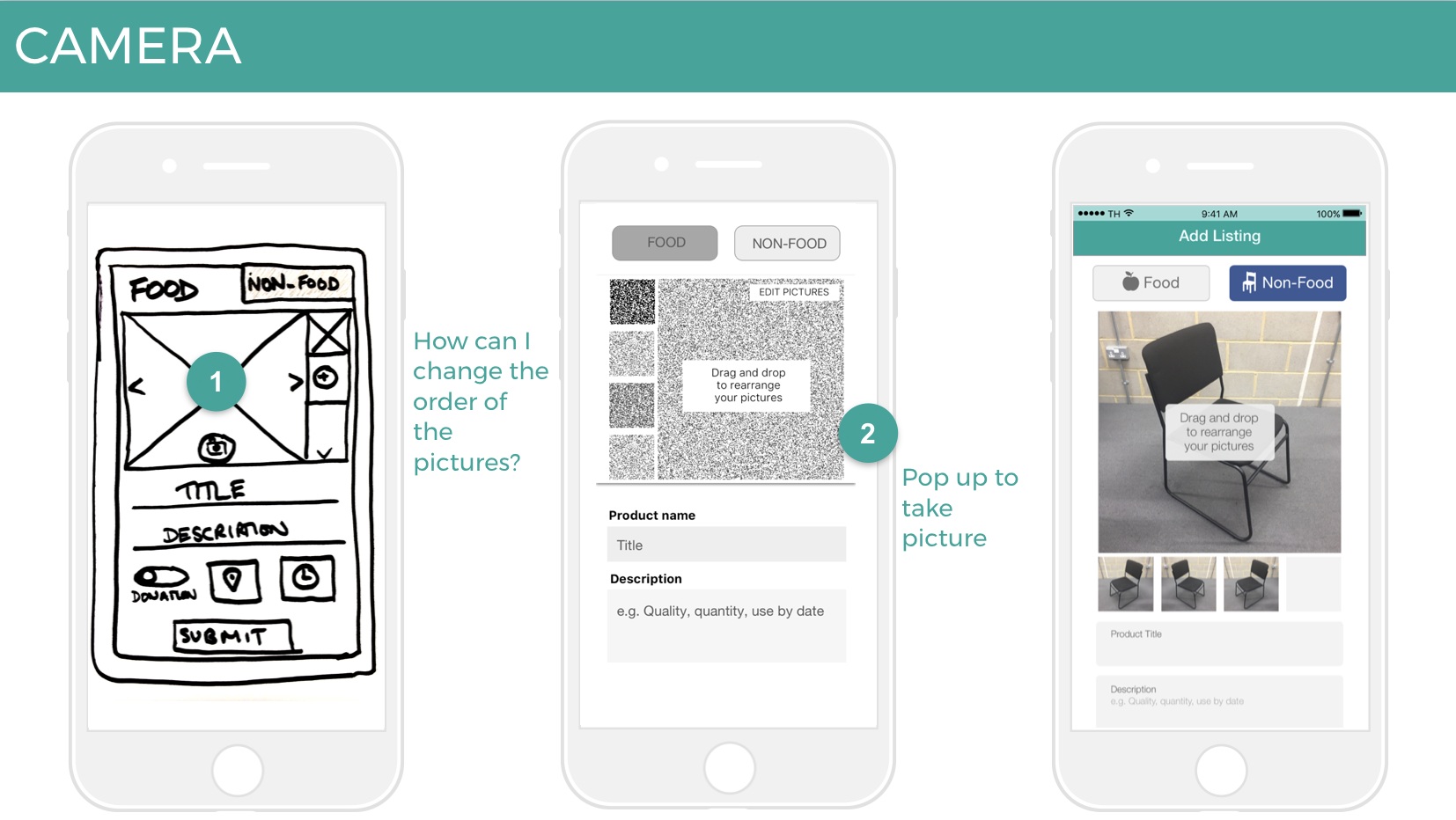
Camera
Having big images was important to our clients so we made the camera a large feature of the page and the first thing you see. We also gave users the ability to rearrange the order of their images by dragging and dropping them.
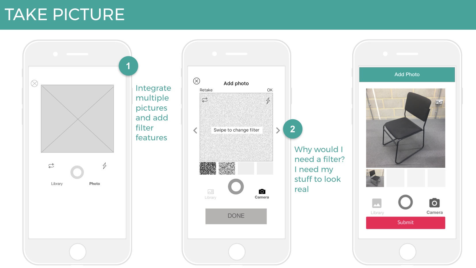
Image Filters
Although we had discussed the ability to edit images and add filters at our design studio session when we tested it with users they were not keen on the idea. This was because if you’re collecting food items you need to know what it really looks like otherwise it may be rotten, or not what they thought, when they go to collect it.
Next Steps:
If we were to continue working with OLIO our next steps would be to look at:
Redesigning the information architecture
Building the community
Redesigning the homepage
Working on the donation feature — many users found this a confusing idea for a sharing app