Stasher - Research & Quick Wins
Hockney-esque affinity map
The Beginning
I joined Stasher in November 2019 as the first Product Designer. The Product Team at the time consisted of a Product Manager, two Front-end Developers, and two Back-end Developers. When I joined, there were several areas that we could focus on improving as part of Stasher's suite of products. These included the customer website and app, the Host Dashboard, and the Admin Dashboard. Although we started with some areas that needed some quick fixes across all the different products, we turned our focus initially to the customer-facing product.
The Challenge
This project aimed to improve the experience for our customers across the search and booking flow. We had baseline metrics for conversion rate at each step of the booking flow which we were trying to improve. As the funnel was multiple steps, I conducted research to decide which area to focus on first.
Product critique with Stasher Team
Discovery
As this was an exploratory project, I wanted to use several different tools to learn as much as possible. There were a few different steps and sessions that made up my initial research phase. These were as follows:
A website audit - to find areas where I struggled and using the ten heuristics to find elements that were working well and those that needed improvement.
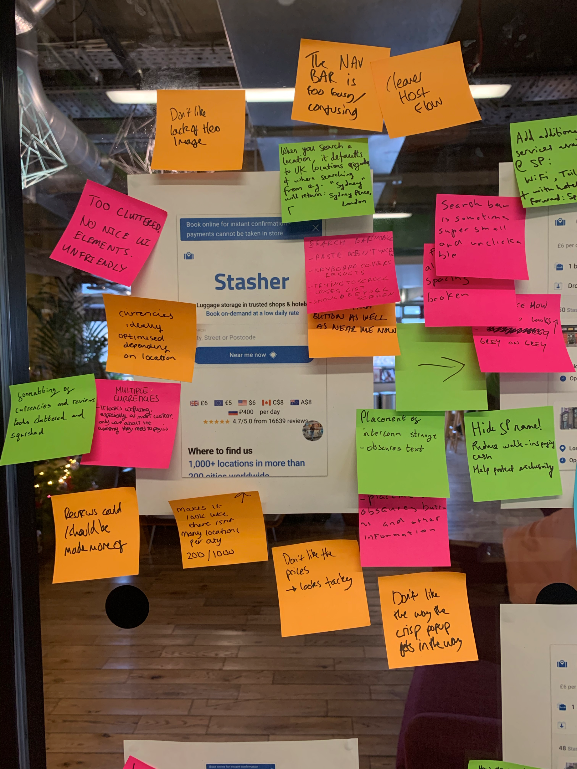
A workshop with Stasher staff where I put screenshots of the journey up on the wall and asked them to critique it using post-its.
Moderated user interviews and testing - asking them to complete tasks, including completing a booking from homepage to confirmation, and gauge their understanding of Stasher.
Findings
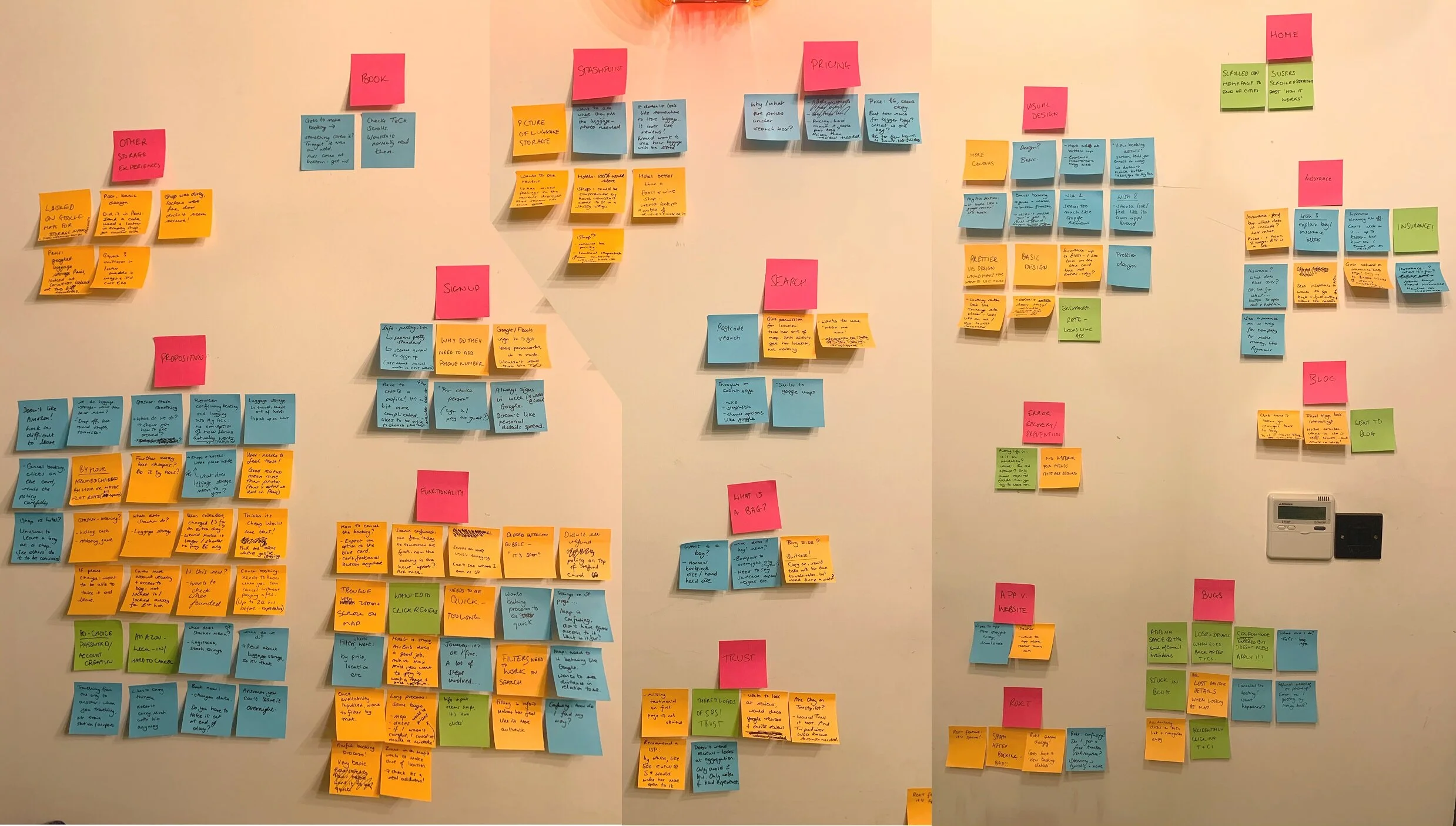
Conducting multiple types of research meant I had a lot of data to analyse and sort through. Working with the Product Manager, we created affinity maps and logged data in Airtable so that we could see the over-arching areas that needed improving.
As you can see from the affinity map at the top of the page, there were quite a few areas that we received a lot of feedback on, these were:
Functionality
Proposition
Visual design
General bugs
Some of these areas were still quite big, so we broke them down further. Reorganising the feedback helped us to focus in on checkout as an area with low-hanging fruit that would provide us with some quick wins.
Stasher’s T&Cs
What we needed to fix
One of the most significant issues that came up during our test was that if for any reason you navigated away from checkout during the booking flow, you would lose all your booking details. The thing that made this more frustrating for the customers and our customer service team was that instead of losing all the selected filters and having to re-enter them, the system instead would default for time and date, and bag settings. The default time was always the time and date it was at the time of booking, and the bag would default to one. This meant that when a customer completed a booking and rightly hadn't been aware of the changes, they were no longer able to cancel as they were already in their drop off time.
This issue had a considerable impact on our completion rate and the number of queries coming through to customer service.
There were a couple of other pain points that came up during our tests which were negatively affected by the problem with navigation. They were:
Users not understanding what insurance meant when they got to checkout.
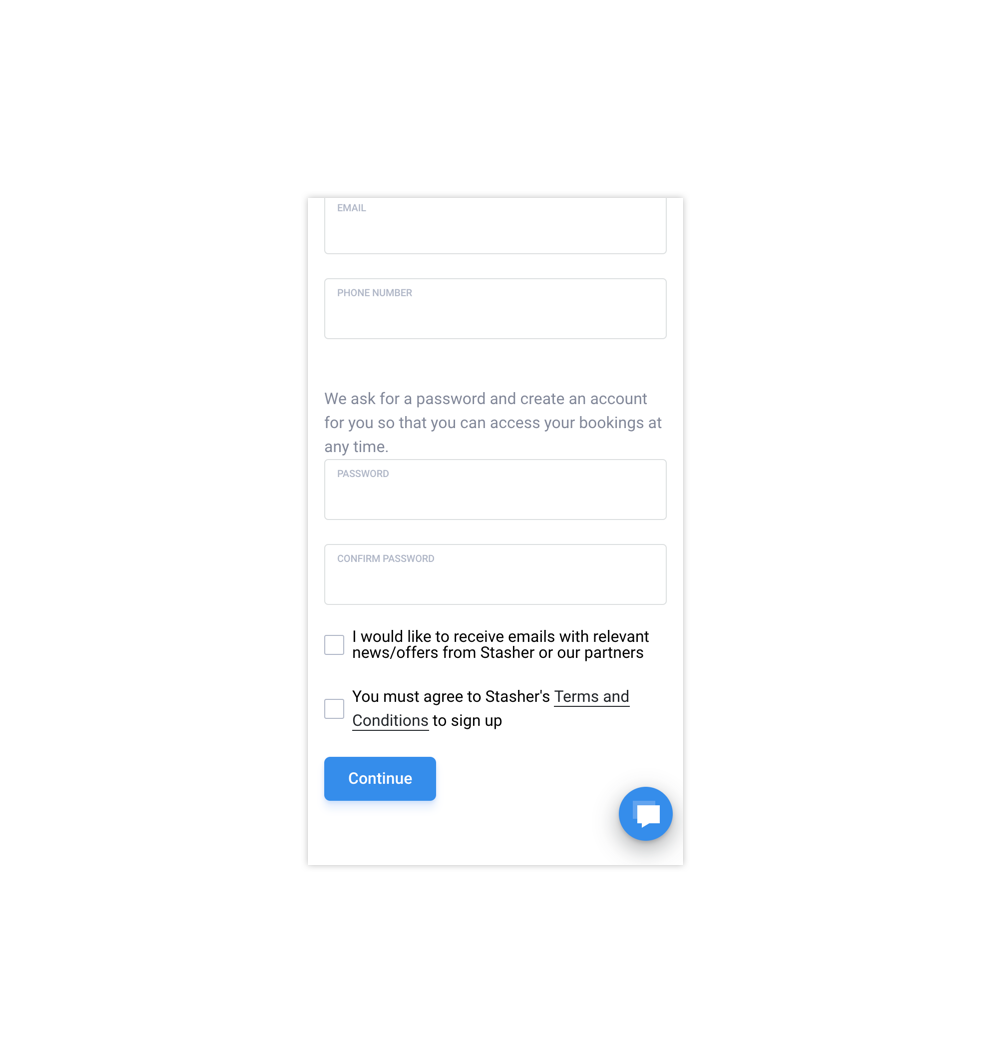
Problems with accepting the terms and conditions (T&Cs) due to the link being too close to the checkbox.
When users came across these parts of the journey, they would either purposefully leave the page to look for answers in the case of insurance, or accidentally leave the page due to clicking the link for T&Cs.
The Solution
After bringing my findings to the rest of the Product Team, we looked at the work that would be involved in fixing the navigation of checkout. At the time, it didn't make sense to invest in that as we knew we were likely to redesign it in the not too distant future. However, we still needed to make sure that our users weren't dropping off or making errors in their booking.
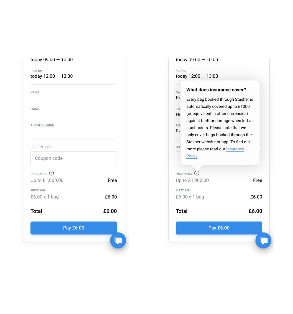
Image of insurance tooltip
To accomplish this, I created a tooltip to give users information on what our insurance included. As we weren’t changing the UI at the time the T&Cs alignment couldn’t be changed. In order to combat this, I had the T&Cs link open on another tab when clicked and increased the tappable area around the checkbox slightly. In doing this users journeys were no longer disrupted and they had a way to get back.
Although these changes seemed small, after making them we saw an increase in the checkout completion rate from 54% before the changes to 70% after.