Stasher - Search & MAp
New Stasher homepage and map
The Challenge
At the end of 2019, I carried out a discovery phase on the Stasher website experience. Based on our research findings, we knew there were a few areas we needed to improve on, as well as there being an appetite for a new look and feel to the Stasher website. After completing work on the landing pages, we turned our focus to the search and booking flow.
The metric we were focusing on was drop off rate, from the homepage to search we had a rate of 65% which we wanted to move to 40%. From search, to book the rate was 58% and we aimed to push that to 30%.
Discovery
I had conducted user interviews as well as usability tests for the landing pages, which meant I had a large amount of feedback to work from to guide the designs. Some of the key points in that feedback were:
The process was too long
The map wasn't working for them - they weren't able to see themselves in relation to Stashpoints
There were several poorly designed and placed buttons
Issues with getting through the process with the right date, time, and number of bags.
Competitor Analysis
To understand where I could improve the experience further, I conducted a competitor analysis looking at both direct and indirect competitors.
Some of the things that came to my attention during this process were:
The way they had customers select their location - They had a separate button whereas Stasher had conflated the 'confirm search' button and 'my location' into one. This confused many users in our user tests.
How they selected filters earlier at the initial search - Stasher only had a field for location, so often users weren't choosing their time and date for storage until much later in the process, and then being disappointed if a place was closed or full.
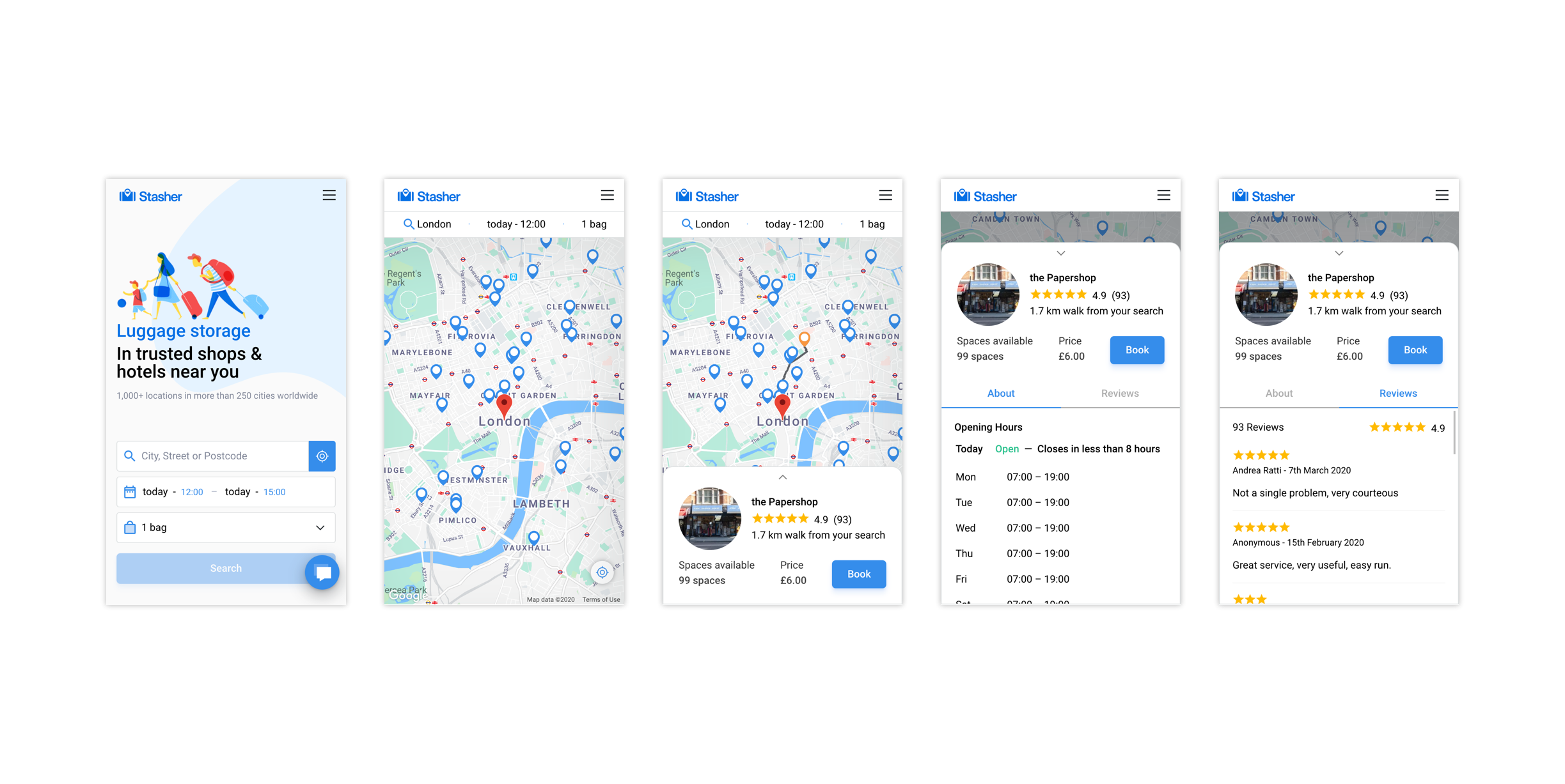
Many of them also used cards on a map as a way of searching rather than a list - Based on the feedback we collected it was clear that users wanted to be able to see themselves in relation to the Stashpoint they were choosing.
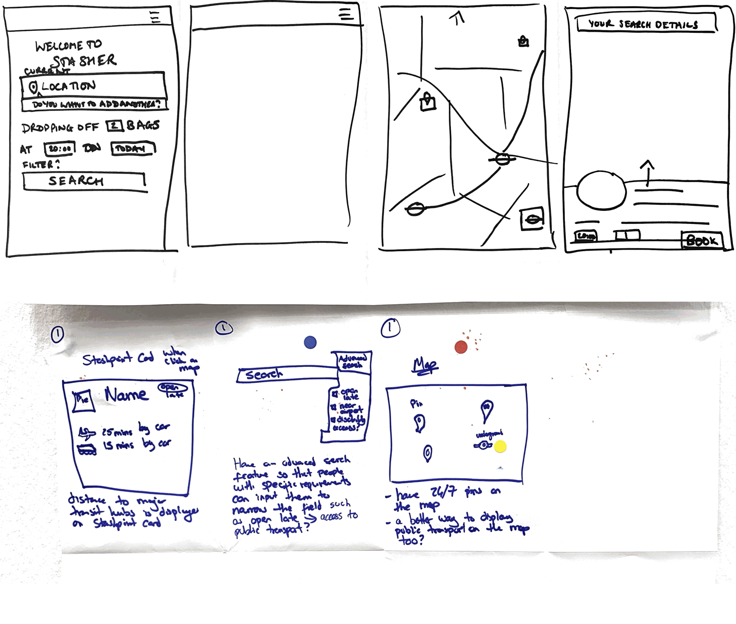
Sketches from crazy 8’s session
Workshop
Being the sole designer, I wanted to ensure I wasn't going to end up with tunnel vision and also wanted more than just my opinion in the room. To do this effectively, I organised a design workshop with five colleagues from different areas of the business, including marketing, partnerships, and tech.
First I presented the feedback, gave them the persona I had created, and set tasks and scenarios for us to work to. I led a couple of rounds of crazy 8's to come up with new ideas separately and then as a group.
Design
The sketches that came out of theses sessions helped to inform my first iteration of the search and map flow. My plan following this first iteration was to conduct user tests and build on those learnings.
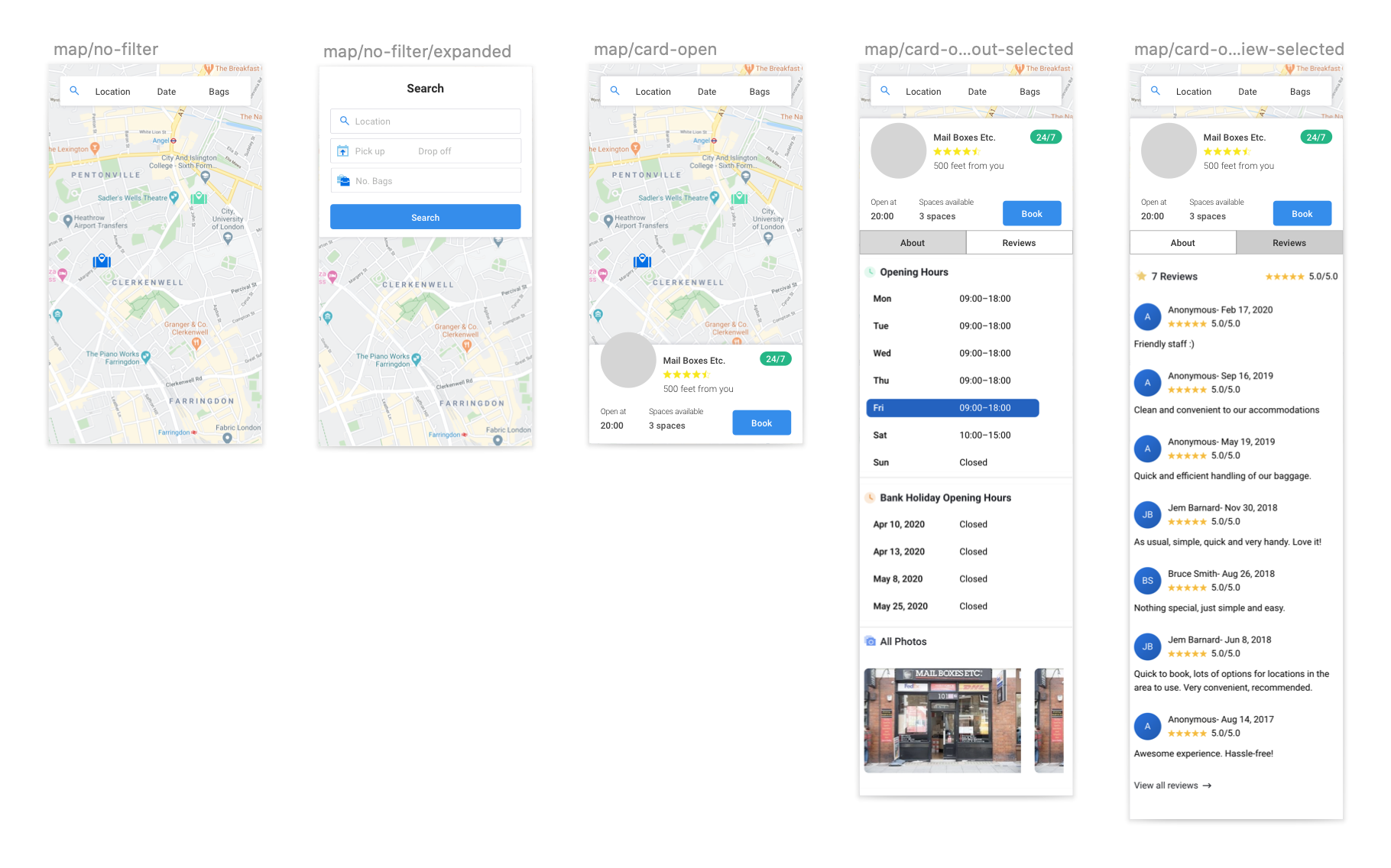
Stasher Mid-Fidelity Designs
Lockdown
We had started this redesign, and then suddenly, the world changed. After discussing the implications of continuing the redesign during lockdown, we decided to take advantage of the quiet time and try and get as much changed as possible.
With this came some changes in the way I was able to carry out my process, which meant I had to be very adaptive.
Except for myself, the PM, and two front-end developers the rest of the company was furloughed, the roadmap changed, and the speed increased. We aimed to complete the redesign and build in 12 weeks (this was how long we initially thought the pandemic might go on for!)
With this, I made the following changes :
Without the rest of the team to run workshops with I needed to be creative in how I collaborated. This meant working very closely with the Product Manager and consistently bouncing ideas off each other. Or when I needed a preference decision made, I would use standup to present and take a vote.
Due to the speed with which we were now working, I was asked not to carry out fully moderated user tests so that we would get everything built. As I believe wholeheartedly in the importance of feedback I had to be creative, running unmoderated user tests using Loop11 to gather feedback on the weekend to inform my design decisions the following week and make sure I was on the right track.
My designs were going straight to build and not always fully designed due to time and budget constraints. This meant that the developers and I had to work even more collaboratively than before. To do this, I would give them a call when I had an early, low fidelity design and we would talk through the requirements, restrictions, and time it would take for all the different features. By doing this, we were able to move more quickly, and the handover was smoother.
This work is still ongoing, but here are some of the changes I made in the current flow.
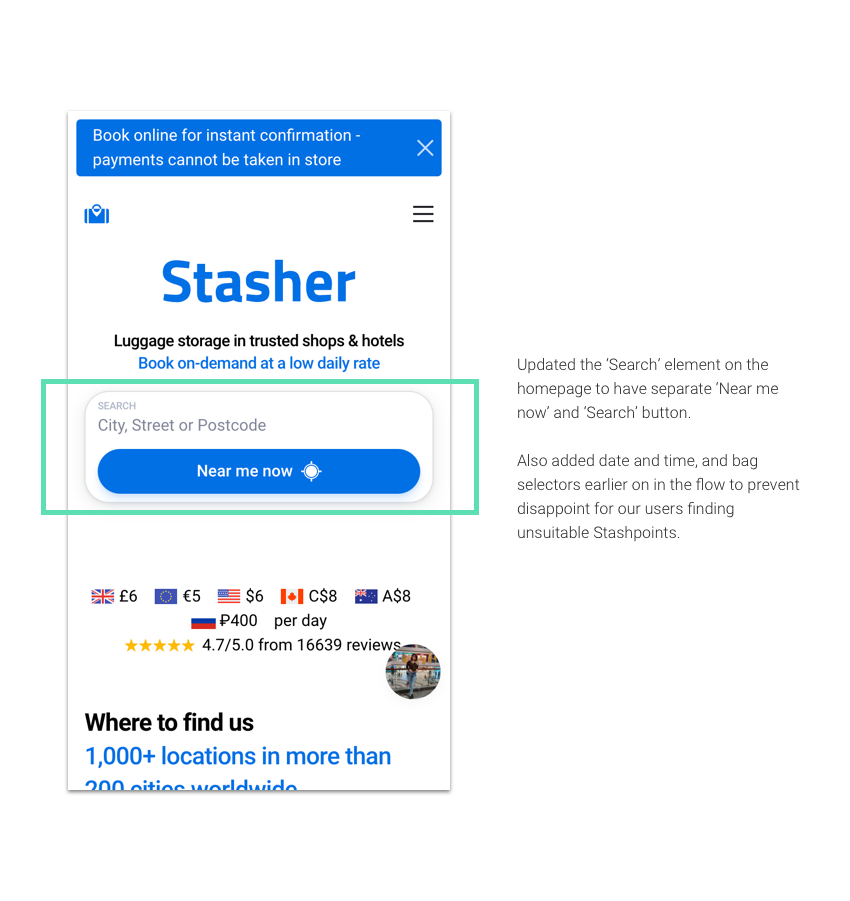
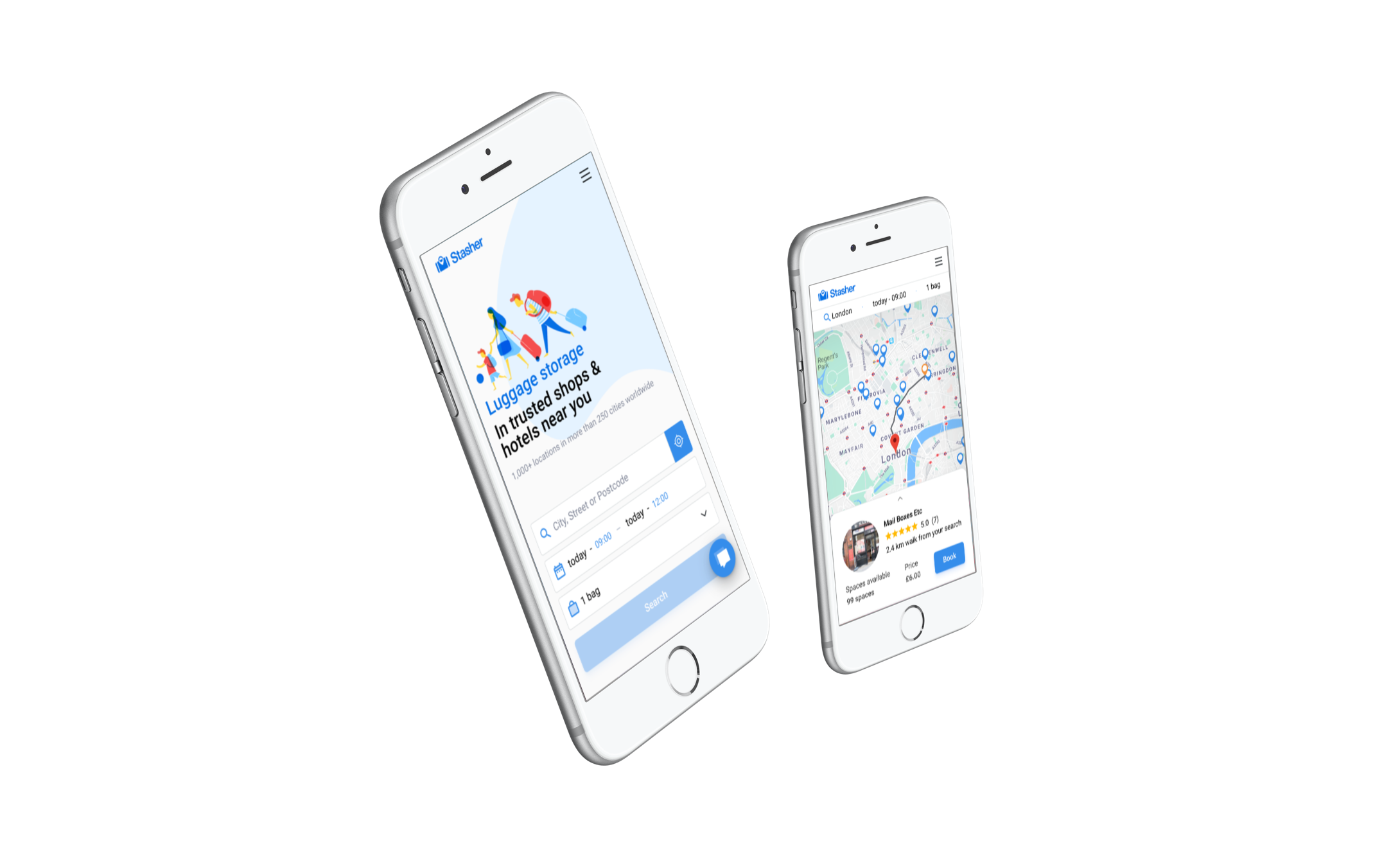
Stasher homepage
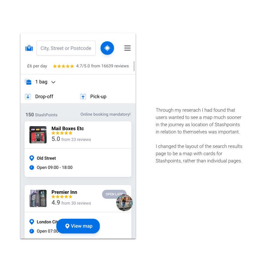
Search results page
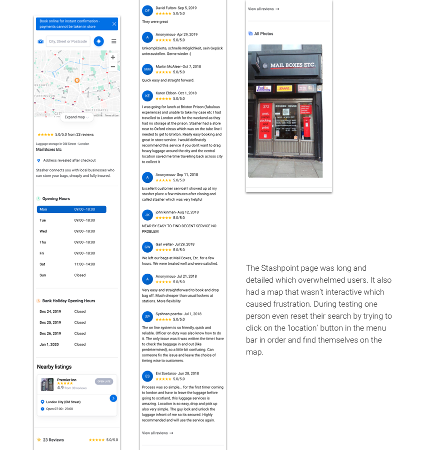
Stashpoint page
Current
Conclusion
Since our original twelve-week roadmap has finished, we have completed and implemented the new homepage and search designs. Although at the start, we had hoped to make changes gradually and analyse the data to see what was working lockdown made this impossible.
We have been able to conduct moderated user tests which have had positive results. However, since traffic has restarted on Stasher, we have also been able to see our conversion rate pick up again. Our benchmark was 7.8%, and we aimed to hit 8.5 or above. During lockdown, we saw it tank to 0.15%, but it has gone back up to 5.7% over a recent 7-day period.
Next Steps
As we continue to work on this project, my next steps are:
To implement tweaks to the design based on user tests and inconsistencies with the original design.
Continue with work on improving checkout
Working with the Developers in creating a new design system and component library based on the new redesign.